Designing a Kids Streaming Experience for TV
Creating a proper TV-first experience for children — not a mobile app stretched to a big screen.
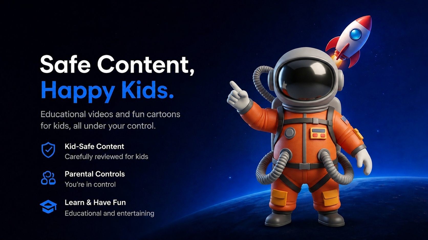
01 — A streaming home built for kids and trusted by parents
Tahseen is a kids streaming platform offering educational and entertainment content with parental controls and subscription access. The mobile and tablet app already existed — my job was to design the TV experience from scratch, the right way.
02 — TV is a different medium — distance, focus, and remotes change everything
The previous designer had started the TV screens by scaling up the mobile design. The result looked like a mobile app on a big screen — small touch targets, no focus states, wrong font sizes, no remote-friendly navigation. I started over with one question: what does a real TV app feel like?
03 — Studying remote-first patterns from the platforms kids already love
This was my first TV project. Before designing anything, I spent time researching how TV interfaces actually work — studying YouTube Kids, Apple TV, and Netflix Kids as a real user with a remote. I mapped their navigation patterns, focus behavior, font sizes, and content hierarchy to build my own understanding of TV-first design principles.
04 — Four decisions that defined the experience
Typography scale — Readable from the couch
TV screens are viewed from 2–3 meters away. I set a minimum font size standard across all screens — display, heading, and body — so text is readable without leaning forward.
Focus states — The remote is the cursor
Users navigate entirely with arrow keys. I designed clear, high-contrast focus states on every interactive element — buttons, cards, navigation items — so users always know exactly where they are on screen.
Navigation structure — Simple, predictable, always visible
Replaced any mobile-style navigation with a sidebar that stays consistent across all screens. Kids and parents can always orient themselves without getting lost.
Parental controls — Safety built into the experience
Designed screen-time limits, bedtime restrictions, and content controls as a natural part of the flow — not hidden in settings.
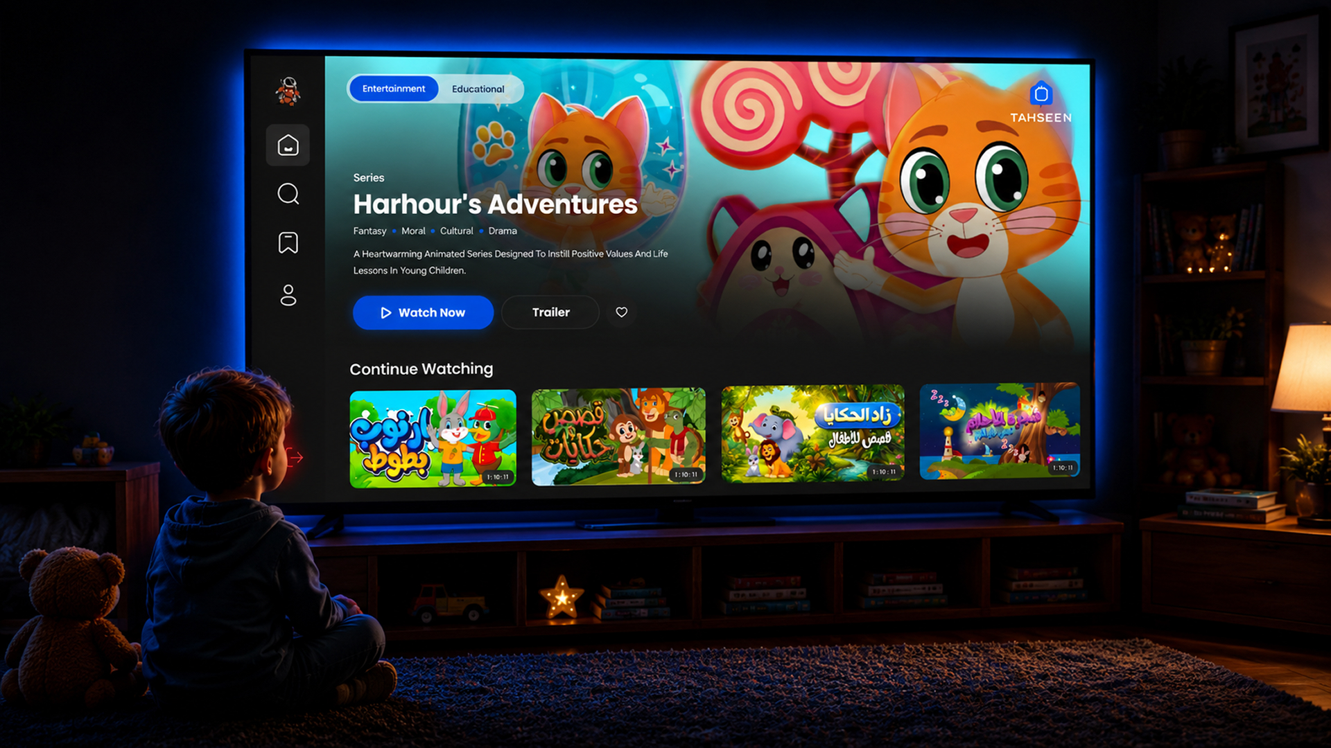
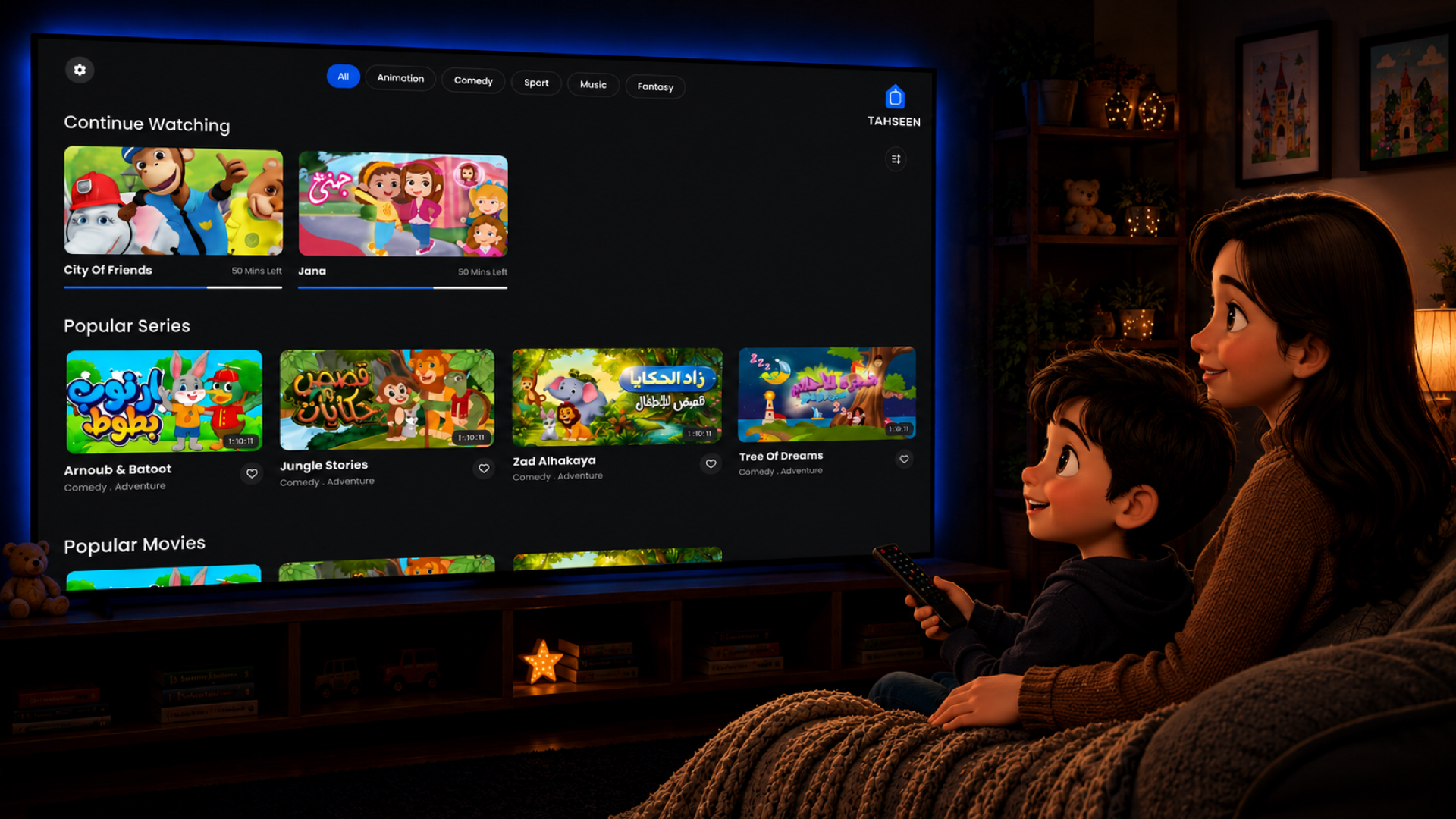
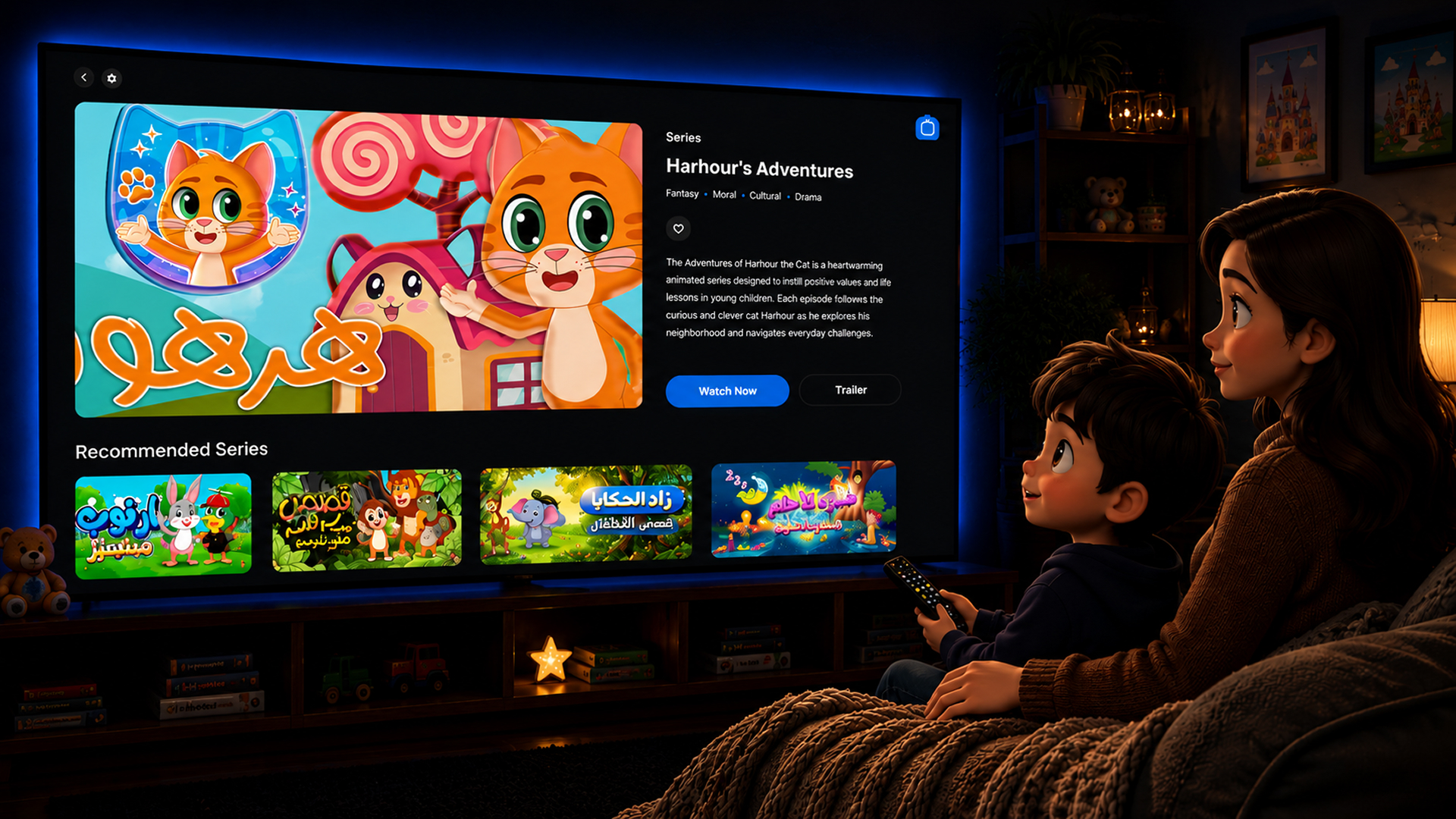
05 — The experience, screen by screen
A focused hero highlights a featured series, while a continue-watching shelf keeps kids one click away from where they left off.
Remote-friendly search with large tap targets and clear content categories — fast to reach, easy to navigate.
Series info, episode list, and watch/trailer actions — all reachable within two remote clicks.
Content organized by category with clear visual cards optimized for 10-foot viewing distance.
Plan selection and payment flow designed for TV — minimal steps, large readable text, clear confirmation states.
Parent zone with access controls, screen time settings, and child profile management.
06 — Images
Key screens from the TV experience — Home, PLP, and PDP — alongside the design system that holds them together.
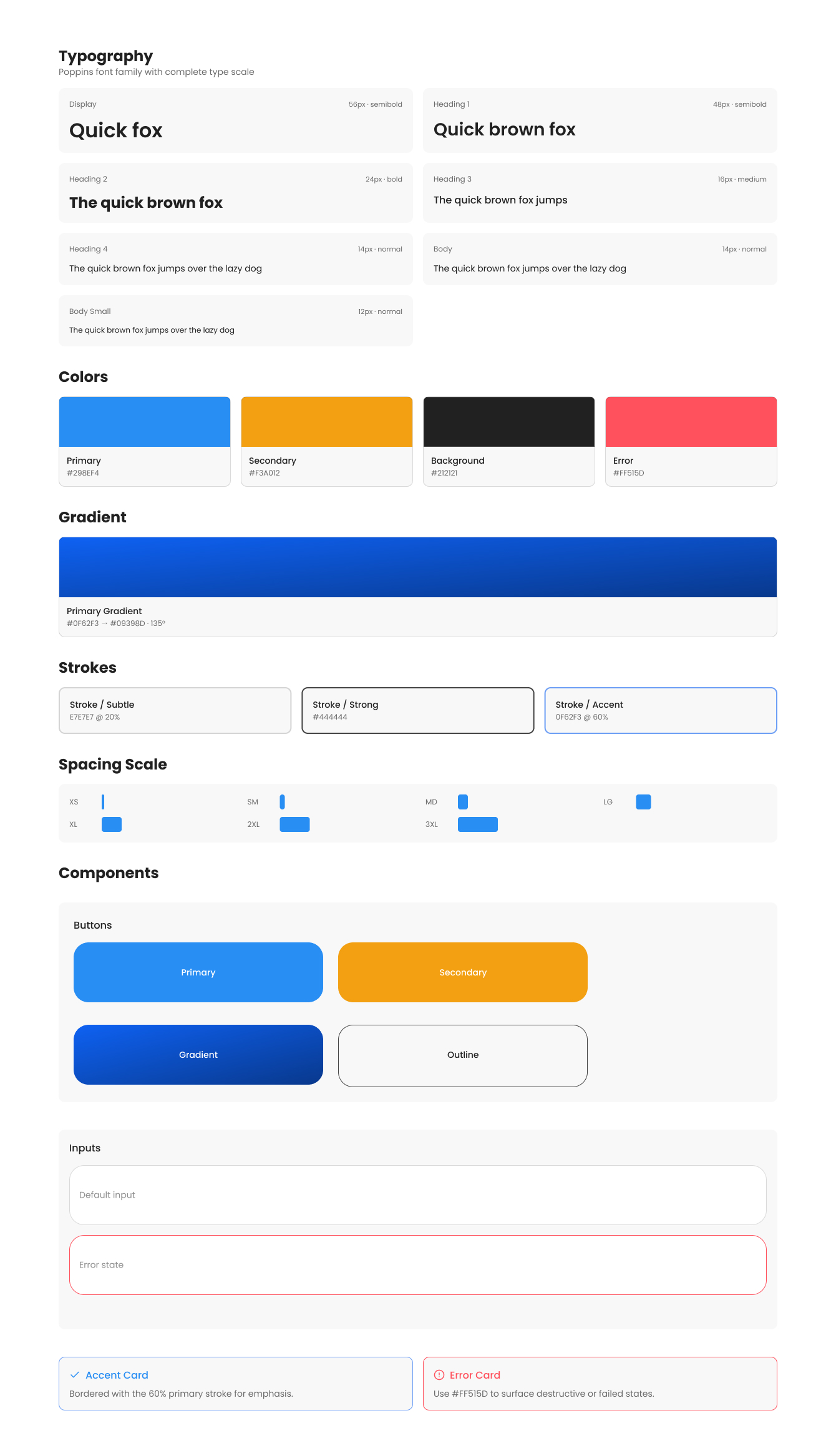
07 — A lightweight system to keep the TV experience consistent
To ensure consistency across 30+ screens, I built a TV-specific design system — color tokens, a typography scale built for distance viewing, focus state components, button variants, and navigation patterns. Everything reusable, everything TV-standard.
08 — Shipping in lockstep with PM and engineering
I had daily standups with the development team and reported directly to the product manager throughout the project. Every screen was reviewed, iterated, and handed off with specs — making sure what I designed was actually buildable and consistent.
09 — A calmer, clearer TV experience for the whole family
The final product replaced a mobile-scaled layout with a true TV experience — readable typography, remote-first navigation, clear focus states, and content kids and parents can trust. From login to playback, every screen was designed for the couch, not the pocket.