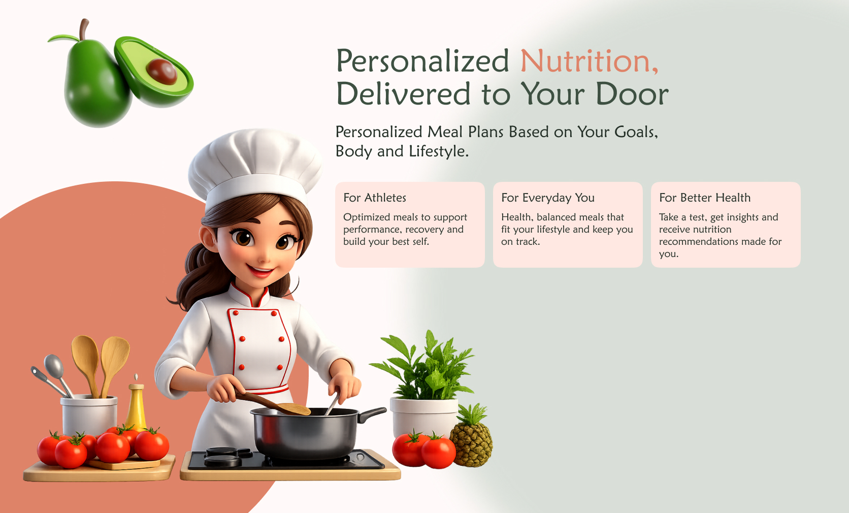
Redesigning a Meal Subscription App
Turning a cluttered, confusing food app into a clean and trustworthy experience users actually enjoy.
01 — A meal subscription built around clarity, not features
Numou is a personalized meal subscription service operating across the Gulf region. Users subscribe to daily meal plans based on their nutritional needs — choosing their macros, delivery days, and meal preferences. The app was live and had real users, but the experience was working against them.
02 — Users were lost inside their own subscription
Opening the original Numou app as a real user, I felt immediately overwhelmed. Too much information on every screen, no clear visual hierarchy, competing colors with no meaning, and a navigation system that gave no sense of location. The product had good features — they were just buried.
03 — Studying what clean meal apps actually look like
The client referenced Calo as the benchmark. I analyzed it in depth alongside Numou's existing app — not to copy, but to understand why Calo felt easier. I also mapped out every user story the PM provided to understand what each screen needed to accomplish before touching any visuals.
04 — Four decisions that defined the redesign
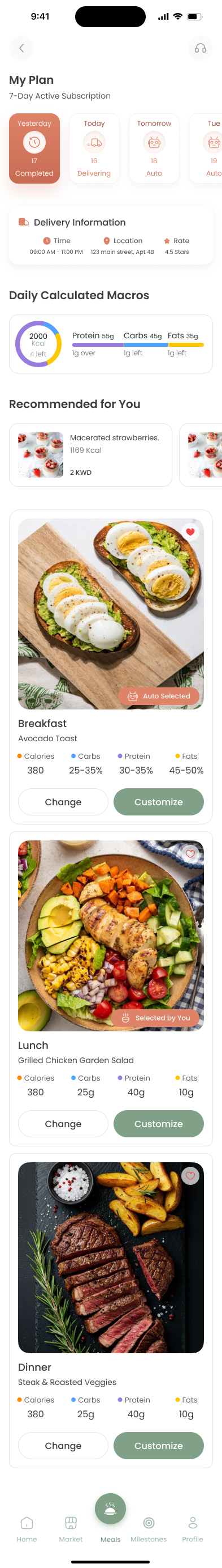
Navigation — One location, always visible
Replaced 5 equal-weight tabs with a clear active state system and page titles on every screen. Users always know where they are.
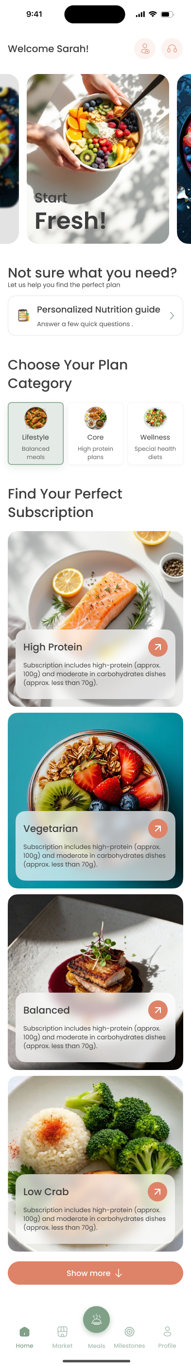
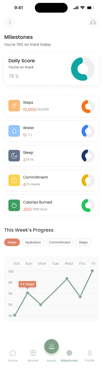
Information hierarchy — One job per screen
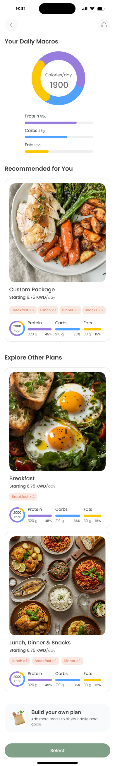
Moved sleep, steps, and hydration out of the home screen. Home now shows only what matters today: macros and the meal plan.
Color with meaning — Same palette, different rules
Client kept the original colors. I gave each a strict role — sage green for brand and navigation, terracotta for primary actions only. Restraint made the difference.
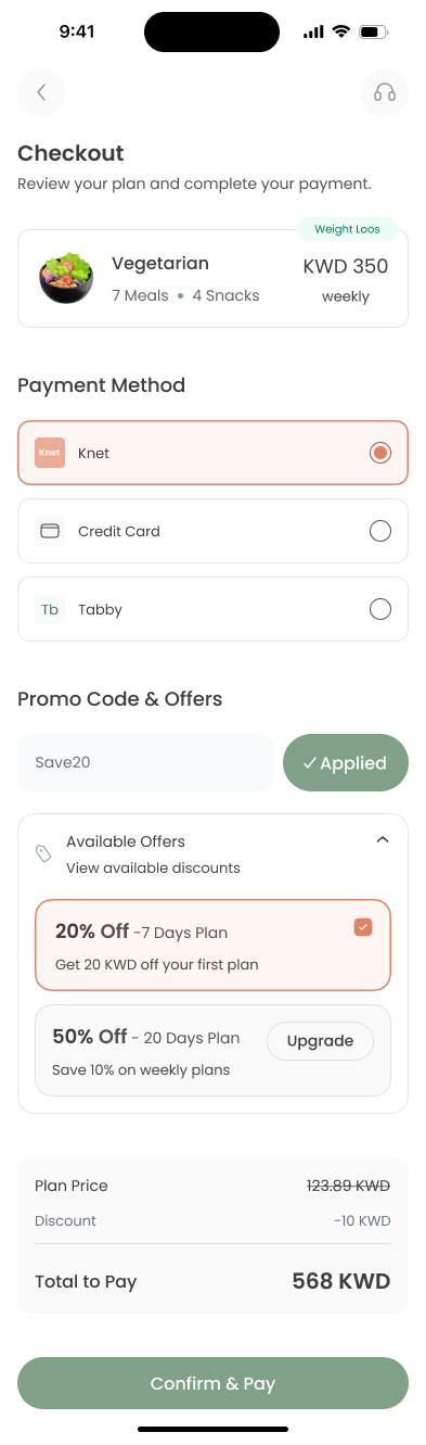
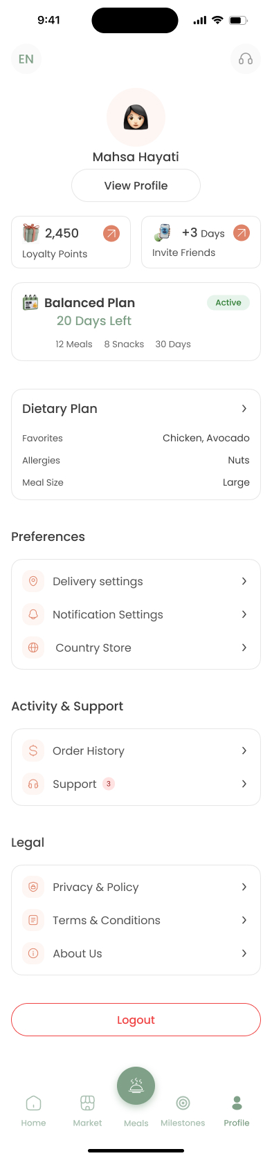
Checkout confidence — 8 states, zero ambiguity
Designed every checkout state — default, filled, promo success, promo error, payment selection, upgrade prompt, and confirmation — so users always know what's happening at the most critical moment.
05 — The experience, screen by screen
06 — A system that kept 50+ screens consistent
Before designing a single screen, I built the component library — color tokens, typography scale, button states, form elements, cards, and navigation components. This made the design coherent across every flow and handoff clean for developers.
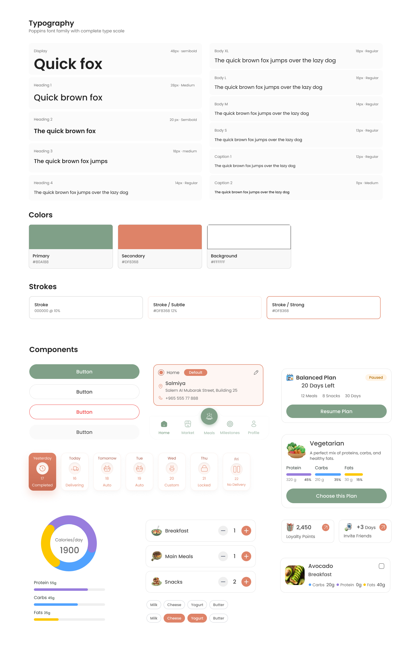
Type scale with clear roles
Poppins styles were defined from display text down to captions, so dense nutrition and plan details stayed readable.
Color tokens with restraint
Sage, terracotta, white, and stroke tokens gave the original brand colors a consistent job across every state.
Reusable mobile components
Buttons, plan cards, meal rows, chips, progress charts, and navigation were standardized before the flows expanded.
07 — Working with PM and client constraints
This was a client project with real constraints — existing brand colors, user stories from a PM, and a live product to redesign. I worked from the PM's user stories to prioritize what each screen needed to do, not just look like. Every design decision was tied back to a user need.
08 — A cleaner, calmer app — for real users
The redesign replaced a confusing, dense interface with a system where every screen has one job, every color has a meaning, and every state is covered. From first open to daily use — the experience now feels like it's working with the user, not against them.